

‘Exploring Design Systems and conducting an audit’
About the audit
Role
In-house designer for Cadent, [advertising
technology platform]
Tools
Sketch
Evernote
Trello
Abstract
Timeline
One month research and presentation — still ongoing task work with the team
Deliverables
Present findings in Design Review roundtable discussion
The Problem:
Like many companies, our Developers and Designers had multiple systems to juggle at varying stages:
📰 Legacy platforms that needed consistent updating
🖥 Shiny new-to-be platforms that required delicate attention
💻 Platforms that were in between styles from rebrands
Without a central toolkit to pull from, our products ended up with a lot of tailor-made solutions for individual problems. There was a lot of ‘Where is this file?” and “Do you have the new blue button?” when looking for something.
Working remotely it became obvious a more robust, complete library was needed to work together efficiently. 📈
I decided to bring these challenges to our weekly roundtable discussion.
First, I went to ‘designsystemchecklist.com’ — This was the perfect tool to evaluate how thorough and scalable the team had built our original system. We scored a 27 out of 50 over a few categories like ‘Core Components’ and ‘Product Management’.
It was easy to wonder what some of the most renowned Design Systems today contained. My curiosity got the best of me and I reviewed site after site.
The Systems:
Systems like Atlassian, Shopify, and HelpScout really go the extra mile. Their sites treat the product-makers as the ultimate user and are openly available online to refer to. Anything you could need from Do’s and Don’ts to Downloadable Resources.. it was all ready for use. Shopify’s page even includes a plug-in that displays the documentation directly in Sketch. Genius!
The Findings:
Just like our components are guided by a clear set of standards and guidelines, our teams should be guided by a living document.
The real challenge is 💬 creating this source-of-truth: as it is ‘always ready to use, while never yet complete’..
Below are some slides from my presentation at the weekly Design Meeting:
‘Working with a Design System’ showed more sub-parts than just a ‘Style Guide’ and a ‘Component Library’
‘Design System Documents’ called for Guidelines, Principles, Philosophies, and Code within those parts
Breakdown of current Design System ‘Documentation’
Examples of possible ‘Designer Tips’ for Components
What was missing: From ‘Developer Tips’ to ‘Motion Principles’
The Discussion:
The team brought up the delicate balance of staying responsive to business needs while making progress on the design roadmap. We knew there would be risk but the reward meant working faster and with better precision.
We accepted the challenge and divided work out within Trello, Abstract, and Sketch.
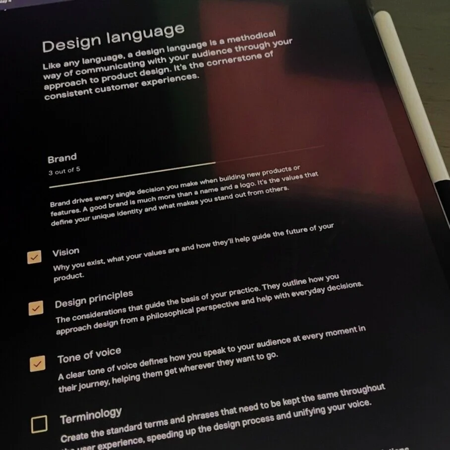
📝 We needed to establish a ‘Design Language’.
To streamline our voice we removed jargon-terms and acronyms to make the experience clear and distinct. We approached the patterns, frameworks, and components all the same way: To communicate our brand’s specific character. We began to ask ourselves ‘How was our voice coming across?’ in all aspects.
🗃 Our ‘Design Kit’ needed major cleaning up.
Consistency across the team and platforms became the focus and it all started with our Pattern Library. Every designer would help make components and templates to help move the process along, and co-editing along the way was important.
📑 A place for ‘Documentation’ to exist was essential.
We wanted to evolve the Design System and its direct relation to the development process. Working with our engineering teams more often created an open conversation about using Abstract as our source for documentation files.
Check out some of the Pattern Library contributions I made here: